
Dawn Hunter's South Carolina Sunshine


FOUNDATIONS CURRICULUM ARC
from ARTS 103 to ARTS 266
with Katlin Jeffcoat, by Dawn Hunter
“What counts is not so-called knowledge of so-called facts, but vision—seeing." by Josef Albers
Katlin Jeffcoat began her exploration of leaf motif imagery in ARTS 103: Fundamentals of Art during the fall of 2022. In this course, students are asked to start from nothing—to go out into the world and find organic or cast-off objects of interest, a kind of visual scavenger hunt. From these discoveries—often rocks, spindly branches, broken glass covered in sand, bricks, or leaves—they select three to five objects and study them closely, creating two data sets: one of shapes derived from their forms and another of textures.

How It Started | ARTS 103, Fundamentals of Art, Fall 2022
ARTS 103 classes are comprised of students at many levels: some have never drawn before, while others bring extensive experience. Regardless of skill level, all are encouraged to cultivate curiosity and use drawing as a tool for inquiry. These inventory exercises function as a sensory and perceptual awakening, prompting students to translate observation into visual language through direct studies from life. Simultaneously, they begin developing intuition about composition—how shape, proportion, and format affect what is drawn within the edges of the page.
Gathering natural objects from her environment, Katlin developed detailed shape and texture inventories that trained her to transform organic form into interpreted and structured design systems. These inventories became the basis for her In Line with Nature project, in which students draw one or more of their objects observationally and juxtapose them within the shapes and textures discovered, or invented, during the drawing process. The resulting compositions reveal moments where the micro and macro collide in unexpected ways—where visceral sensory perception and abstraction coexist within a dynamic, balanced design.

Image 1: Shape and texture inventory drawing, Image 3: Final In Line with Nature composition, Image 4: Iterative composition development (juxtaposition studies). Images courtesy of Katlin Jeffcoat. Visit my Mixed Media Drawing Adventure blog post to learn more about the project.
How It Continues | ARTS 107: Color and Composition
The visual fluency that Katlin developed in ARTS 103 carried forward into ARTS 107: Color and Composition, where students explore the emotional and structural power of color through Johannes Itten’s Color Harmony theory. Building on their earlier studies of form, texture, and design systems, students now investigate how color relationships influence perception, meaning, and visual balance.
Johannes Itten of the Bauhaus organized a 12-hue color wheel—composed of primary, secondary, and tertiary colors—and defined harmony as the joint effect of hues arranged in precise relational structures. His seven color contrasts, central to his teaching, link aesthetics to human perceptual and emotional responses shaped by light and nature. These contrasts include:
-
Hue – high-noon color clarity
-
Light–dark – moonlight and nighttime transitions
-
Warm–cool – the shifts of sunrise and sunset
-
Complementary – the neutralizing balance of opposites
-
Simultaneous contrast – the mechanism by which we distinguish the lion from the grass
-
Saturation – the tension between purity and grayness
-
Extension – proportion and dominance, the primal dynamic of firelight and shadow

Above: Color pencil studies exploring triadic and complementary harmonies by Thomas Kirsten. Images courtesy of the artist
From these contrasts, Itten derived geometric harmony schemes within the color sphere. Alongside analogous and complementary pairs, artists and companies such as Disney and Duffy & Partners commonly employ triads (three evenly spaced hues), tetrads (four hues forming two complementary pairs) or hexads (comprised of three pairs of complements or three pairs of split complements). A classic tetrad such as yellow-orange / blue-violet and red / green demonstrates the balanced energy of dual complements.
In the Color Harmony sequence, students create digital or physical studies of triads, tetrads, and hexads, learning to organize hues according to Itten’s principles. These structured exercises culminate in expressive compositions that merge harmony with personal interpretation, challenging students to connect color harmonies to universal emotions, conceptual ideas, or personal symbolism—bridging analytical rigor with intuitive response.
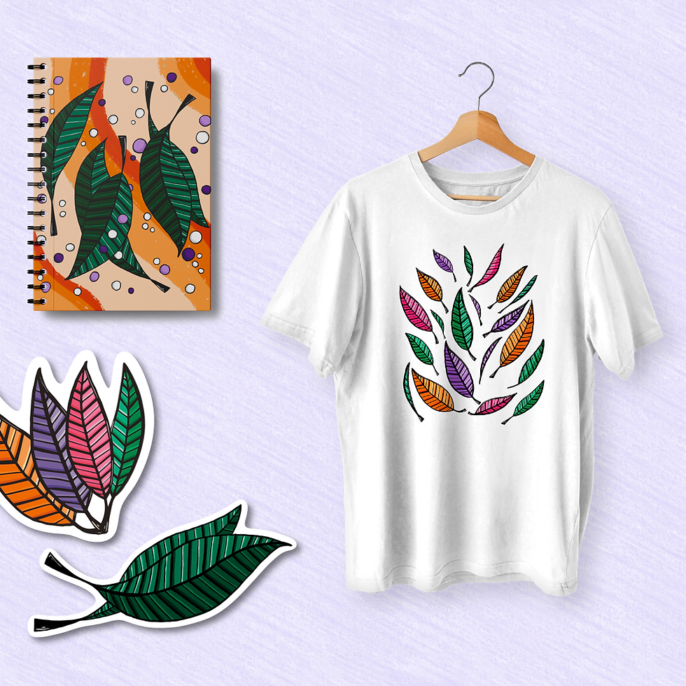
Katlin’s later Merch Project draws directly from this foundation. Her use of a hexadic scheme, orange, red-orange, violet, blue-violet, green, and yellow-green followed Itten’s principles through variations in pure tones, tints, and shades, demonstrating a mature understanding of color harmony. In doing so, she transformed her earlier leaf motif into a cohesive color system that balances contrast, unity, and emotional resonance.

Above: Acrylic final composition applying Itten’s Color Harmony triad comprised of orange, green, and violet by a peer of Katlin Jeffcoat's Thomas Kirsten. Image courtesy of the Thomas Kirsten.

Above: Itten's Color Star set to a harmonious triad as seen in the interactive rare book Johannes Itten The Color Star published by Van Nostrand Reinhold, 1986.
How It’s Going | ARTS 266 GD+I Merch Project, Spring 2024
By spring 2024, Katlin had transformed her Foundations visual research into a cohesive visual language. Drawing from the imagery she developed in ARTS 103 and applying Johannes Itten’s theory of harmonious hexad, featuring orange, red-orange, violet, blue-violet, green and yellow-green, she created a merchandise concept for her ARTS 266 GD+I class that unites design and meaning. Her work demonstrates how the foundational study of line, shape, and texture can evolve into refined visual branding grounded in both craftsmanship and conceptual clarity. Through this synthesis, her work visually traces the curricular arc of Foundations as it manifests in upper-division coursework. Visit kjn_art on Instagram to learn more!

Above: Katlin Jeffcoat’s “Merch Menu” from ARTS 266. Images courtesy of Katlin Jeffcoat.

Above: Itten's Color Star set to a harmonious hexad as seen in the interactive rare book Johannes Itten The Color Star published by Van Nostrand Reinhold, 1986.
Katlin Jeffcoat's Merch Menu Gallery
Click on the photo to enlarge each image.
 Katlin Jeffcoat's Merch MenuTitle page |  Katlin Jeffcoat's Merch MenuSkateboards |  Katlin Jeffcoat's Merch MenuNotebooks and re-usable bag |
|---|---|---|
 Katlin Jeffcoat's Merch MenuNotebook, stickers and t-shirt |  Katlin Jeffcoat's Merch MenuEntire collection |