
Dawn Hunter's South Carolina Sunshine


FOUNDATIONS: ARTS 107
Contrast of Hue
by Dawn Hunter, Project Author
and ARTS 107 Course Director
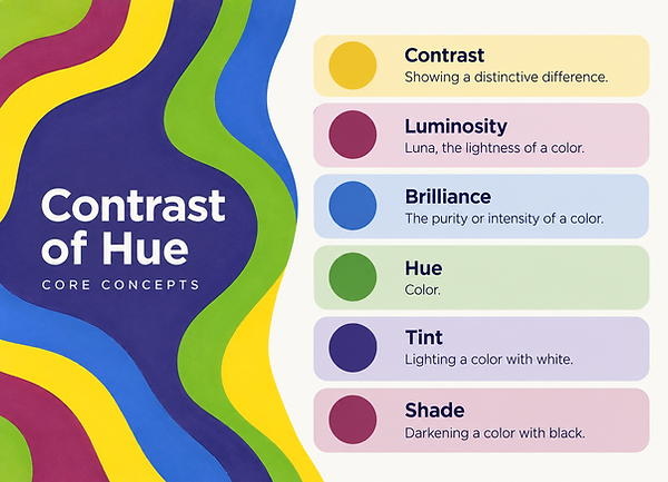
Contrast of Hue is the most direct and fundamental of Johannes Itten's seven color contrasts. It occurs when distinctly different hues are placed in relationship to one another, allowing the identity and character of each color to become immediately apparent. The effect is strongest when colors are used at high intensity and when the hues are clearly separated on the color wheel. Itten identifies yellow, red, and blue, the three primary colors in his system, as producing the strongest contrast of hue, while combinations of secondary and tertiary colors generally create progressively subtler effects. Although contrast of hue can be explored with only a few colors, changing the number, proportion, placement, value, or intensity of those colors can produce an enormous range of visual and expressive possibilities.
Student work in this section was completed by Lauren Sokol, a USC Art History BA major. Contrast of Hue.

Continued, Understanding Brilliance:
Through a series of digital and physical studies leading to final compositions, students investigate the concept of color brilliance as defined by Johannes Itten. By arranging hues in deliberate adjacency, they analyze how variations in value intensify visual contrast and luminosity. The project cultivates sensitivity to chromatic interaction and teaches students how precise hue relationships can create dynamic optical effects within compositional design.

Student work in this section by Lauryn Hopson:
Contrast of Hue digital preliminary, left, and final composition, right, acrylic on paper, 5" × 8".
Why is Contrast of Hue Important?
Contrast of Hue: Introducing one of the key elements that comprise a painting, students learn how a color looks when it is experienced in the presence of other colors. How the visual character of a color is affected by the colors that are next to it and by the amount of space that other colors occupy in a composition. Strong, undiluted colors create works of art and designs that are energetic, bold, playful, dramatic or monumental. Reducing the value and/or saturation of the hues in a composition to create a softer, more atmospheric version of the same color relationships is also possible. The colors black and white have on other colors is also a factor in a painting. Studying Contrast of Hue moves beyond learning about the Color Wheel and how colors are organized. Students learn how colors in a composition affect each other with regards to visual hierarchy, space, unity, emphasis and expression.


Students enrolled in ARTS 107 include both majors and non-majors. This student work example is by USC School of Visual Art and Design BA major Jessica Medina. Image 1: Digital preliminary study for the final painting, Contrast of Hue. Image 2: Physical preliminary study of pure forms, Contrast of Hue. Image 3: Final painting. The iterative process of exploring color first through a digital schematic and then through physical studies of pure form is essential to developing an understanding of color relationships before translating those relationships into a final painted composition. Images courtesy of Jessica Medina.
Applying Contrast of Hue
Using Contrast of Hue is often easier when studying simple compositions using clearly different colors such as in the examples of stripes, grids and fields of color. A simple composition makes it easier to study the relationships between the areas of color as opposed to getting caught up in the images themselves and the many shapes that would be found in them. Students can vary the number of hues, the proportions of the colors, their placement and the relative intensity of the colors. For example, one color can be more dominant than the others and the rest of the colors used as accents. Students can also vary the number of hues and have them occupy approximately equal areas of the composition. Adding black and white to the colors already being used can also be very insightful as to how they affect the luminosity of neighboring colors. Once students have applied these principles in a series of controlled studies, they can then apply them to more complex compositions using Contrast of Hue intentionally to create areas of emphasis, to lead the viewer’s eye, to better organize a composition, to express a certain mood, and to intensify the overall expressiveness of a work of art.


Students who take ARTS 107 are majors and non-majors. Student work examples: USC McCausland College of Arts and Sciences BA Art major Naomi, Contrast of Hue: Octopus Tentacles in a Row of Shades, left; and USC College of Social Work BSW major Marjorie Jane Stephens, Checkerboard and Circles in Pure Colors, Tints, and Shades, right. Images courtesy of Naomi and Marjorie Jane Stephens.

The Assignment Sheet
Click on the assignment for the full page to pop-up!


Student work by USC Studio Art, BFA Major, Maria Castro,
Final painting: Contrast of Hue, acrylic on paper, 6" x 6".
Seeing Color as Form
After Contrast of Hue, we study Cold Warm Contrast in ARTS 107. In this "new" color contrast, we explore Seeing Color as Form rather than seeing Color as something to be applied to a form. Students are asked to reuse their designs from their Contrast of Hue project. However, the expectation is that the colors are organized according to the "rules" of Cold-Warm Contrast in a gradual transition of brilliance. Therefore, even if the design is mostly the same as before, the final composition can look very different. Some areas will advance, others recede. Boundaries between forms will become more or less visible. Paths of viewing will change. Forms that were previously most visible will become less visible than others.

Student work in this section was completed by Lauren Chapman, a BFA major in the McCausland College of Arts and Sciences. Contrast of Hue, left, and Cold-Warm Contrast, right. Both works are acrylic on paper, 5 × 8 inches each.
This comparison allows students to experience an important principle of color theory directly: color and form are inseparable in visual perception. Itten writes that in a pictorial work, the expressive qualities of form and color should be “synchronized,” so that each supports the other. He also emphasizes that a color must always be understood in relation to its surroundings rather than as an isolated phenomenon. The paired student works make these ideas visible. Changing the color relationships changes how the same or similar forms are perceived, demonstrating that color is not simply contained by shape—it helps determine how that shape functions within the composition.
By repeating a design, the student’s focus is pulled from creating a new composition to observing and studying color. The first painting becomes a reference point for the student to compare with the second. By going through this process of iterating on a composition, students are able to better understand how changes in temperature, hue, value, and spatial relationships affect characteristics such as spatial depth, emphasis, movement, balance and expression. This exercise in reusing a design to connect two of Itten’s color contrasts helps to reinforce the greater point that color is a structural component in visual forms and that to understand color one must understand how it functions within visual compositions.

Conclusion
Contrast of Hue explores how color can continue to support visual investigation once initial forms have been generated. By further analyzing how different hues change in relation to each other and then using those relationships in a final composition based on preliminary studies, students discover that color can function as an active component of form as opposed to simply being applied to it. Through the process of experimentation, repetition and refinement, students are able to determine how color can establish emphasis, movement, and relationships within space and ultimately how color can affect the overall perception of a work of art. These new ways of perceiving, thinking, and creating with art will serve as the foundation for continued exploration of color as a dynamic visual language that can be revisited, modified and applied in a variety of new situations.
Student work by USC Art History, BA Major, Ollie Williams. Final painting: Contrast of Hue, acrylic on paper, 6" x 6".